Lou Malnati’s
Rebranding Concept, Marketing Collateral
Challenge
Lou Malnati’s, a cornerstone of Chicago’s deep-dish pizza scene since 1971, sought a refreshed brand identity to stay relevant with younger audiences and stand out in a competitive fast-casual market—without alienating its loyal customer base. The existing brand, while beloved, was visually dated and inconsistent across locations, menus, and digital platforms. The challenge was to modernize the brand while honoring its rich heritage and neighborhood roots.
Approach
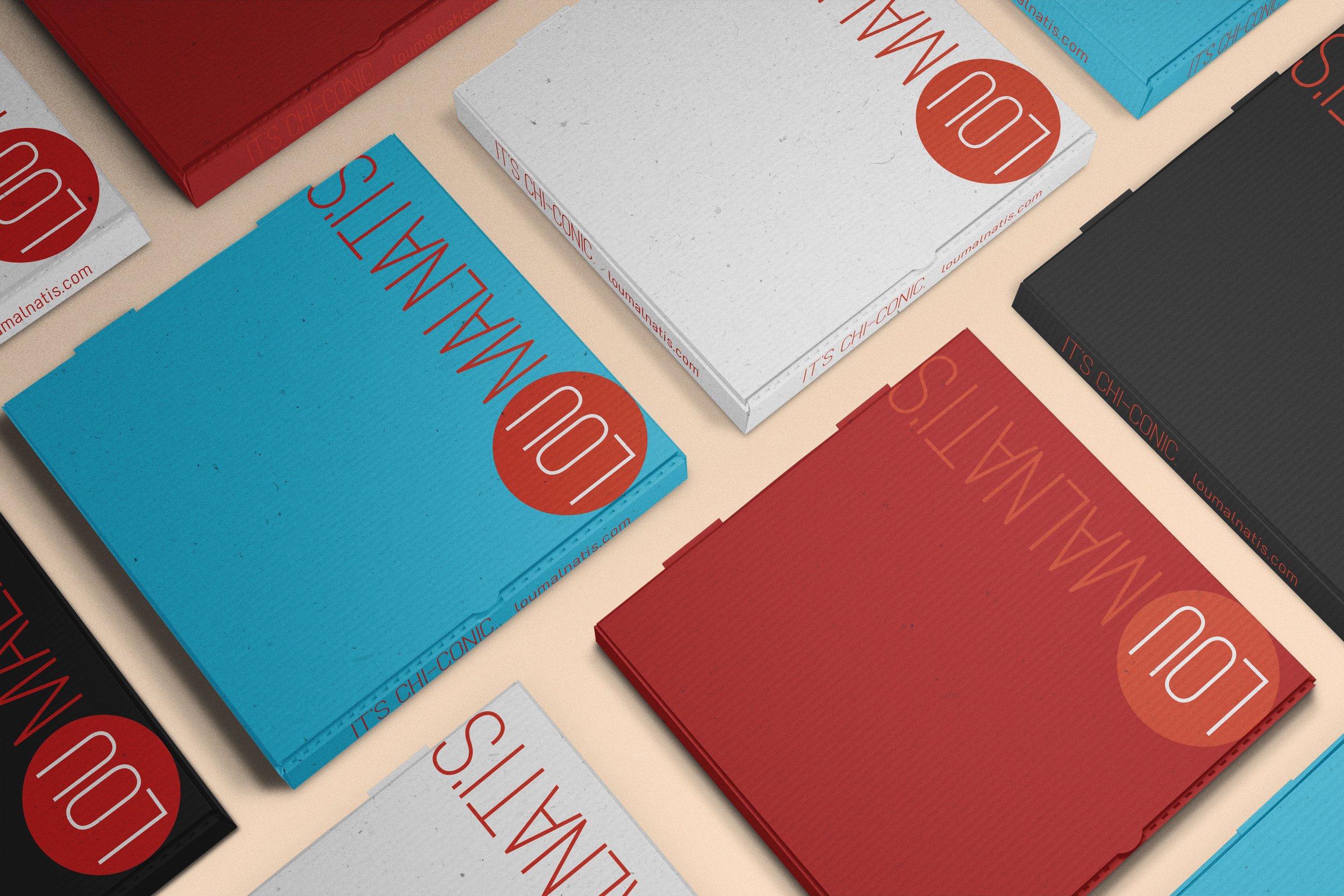
While in the research phase, I noticed that most competitors had generic pizza logos and lack of a cohesive brand. My strategy was to stand out amongst the mundane pizza places and modernize the legacy of this Chicago restaurant. Within the logo, the circle around “Lou” is a simple, abstract representation of a pizza or a slice of pepperoni. The elevated rebrand includes a logo update, fresh color palette, typography, packaging and in-store graphics.
Outcome
The rebrand successfully launched across flagship locations and digital platforms, receiving positive feedback from longtime fans and new customers alike. Lou Malnati’s now enjoys a refreshed presence that feels both proudly local and confidently contemporary.


